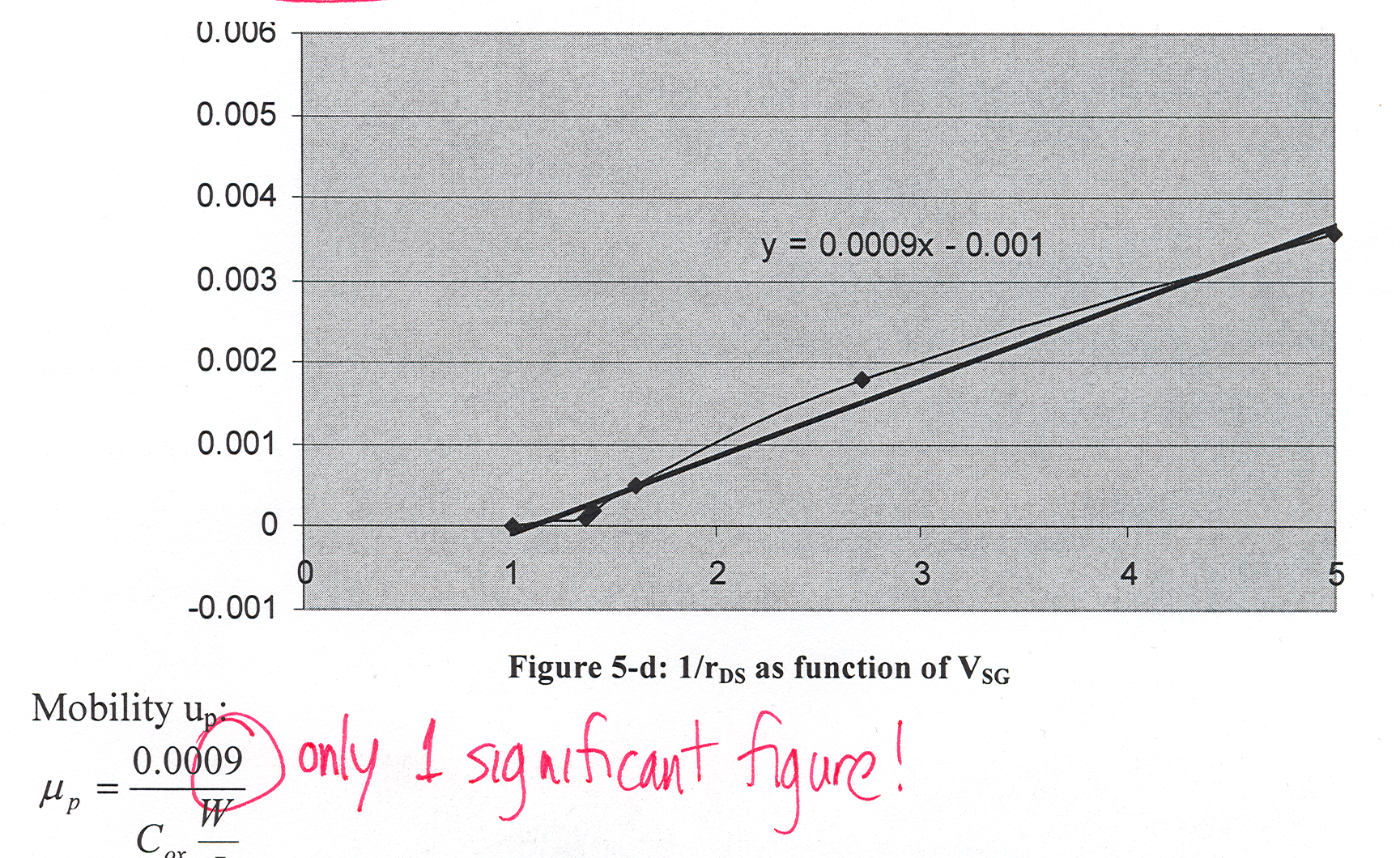
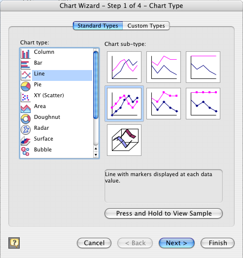
If you choose "Line", you get a plot
like this:
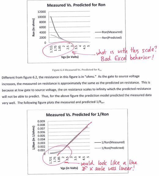
What is wrong with this picture? Look carefully at the values for the data points on the x-axis, and then the spacing on the x-axis. The student correctly took more data points at finer resolution between 1.7V and 1.9V, to accurately determione the threshold voltage VTH. BUT in "Line" plot mode, Excel plots the points at uniform spacing regardless of the actual x values! So what should look like a straight line according to the mathematical model doesn't look straight!
To avoid this, choose "XY Scatter" rather than "Line" - or use MATLAB which is better for real engineering.
What is wrong with this picture? Look carefully at the values for the data points on the x-axis, and then the spacing on the x-axis. The student correctly took more data points at finer resolution between 1.7V and 1.9V, to accurately determione the threshold voltage VTH. BUT in "Line" plot mode, Excel plots the points at uniform spacing regardless of the actual x values! So what should look like a straight line according to the mathematical model doesn't look straight!
To avoid this, choose "XY Scatter" rather than "Line" - or use MATLAB which is better for real engineering.